Tuesday, January 29, 2008


Stefan Sagmeister was an interesting designer. He talked about how people perceive text. I particularly was interested in the portion of the video where he displayed a man with tattoos all over his body. Tattoo art is seldom recognized and was made popular by soldiers who went to war or prisoners. I think that is vital that we look at the type of fonts that are used for tattooing. In the picture of the tattooed man we can see words that are written that are to show emotion. I think his work was particularly interesting because of his use of the body. Hi use of text and body components give a feeling of our external bodies morphing with the text.
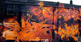
As I was examining different types of fonts I started to think about how letters in general have been manipulated since they were created. I was interested in how artists change lettering to suit their style. The appearence of a font lies in the viewers perception of the lettering. With Graffiti lettering sometimes lettering is manipulated or morphed so much that viewers become uninterested because it is unlegible. On the other hand some people enjoy the puzzling together or figuring out these complex letters which graffiti artists call "Wild Style" lettering.

Tuesday, January 22, 2008


Davis Carson was quiet a complicated artist. He was not traditionally taught the history of art. He simply jumped into typography without researching first. He wanted to come up with a new style of page layout in where text becomes experimental and abstracted. I find this very interesting because text is not researched enough in artwork. Artist have been trying to change the way viewers interpret text for many years and until now they have only scratched the surface. If we compare the changing of text to graffiti then we can see throughout history graffiti letters have been changing and morphing into abstracted forms of the original text. I feel Carson is doing the same thing the way he innovated text by changing the different fonts and placing them in irregular positions. Also in a way he reminded me of Burroughs in the fact that he was interested in the way that text was placed "cut up" and then used over again repeatedly.